Colour guide
Yellow
Yellow in interiors: Adds optimism and visual lift, especially in darker rooms that need perceived warmth.
1 product family
2 options
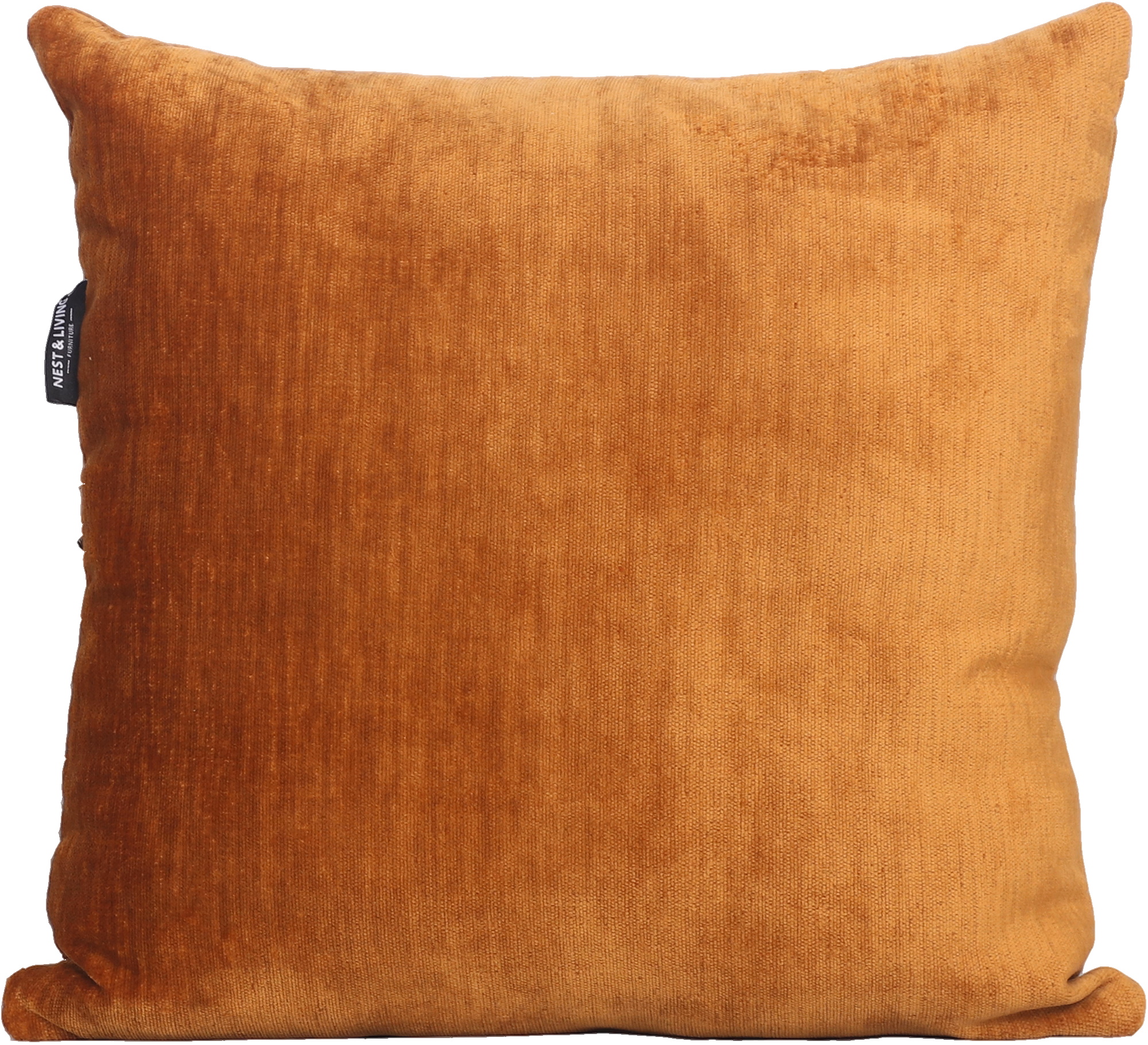
Yellow appears across 1 product family and 2 options, especially on Decorative Cushions.
Visual meaning
Yellow reflects light strongly and is psychologically associated with warmth and alertness. That makes it useful for lifting neutral rooms, but too much high-saturation yellow can feel restless.
In furniture design the most versatile yellows are usually ochre, straw and mustard tones because they sit closer to natural materials and age more gracefully in a palette.
How to pair it
Use yellow as a spark inside a mostly neutral or blue-grey room. It works well in cushions, small rugs and occasional pieces where the eye benefits from one warm highlight.
When building a full palette, pair yellow with one stabiliser such as grey, walnut or olive. Without that grounding colour, the room can start to feel visually noisy.
Palette planning cues
Works well with
- grey
- blue
- brown
- green
- white
Use in the room
Start from undertone before hue intensity. If the colour reads warm, pair it with warm neutrals or a controlled cool counterpoint instead of unrelated cool greys.
Build one dominant field, one bridge neutral and one accent. That is the simplest way to keep a furniture package coherent instead of scattered.
Browse related products