Colour guide
Red
Red in interiors: Signals energy and focus immediately, making it best as a controlled feature rather than background repetition.
5 product families
12 options
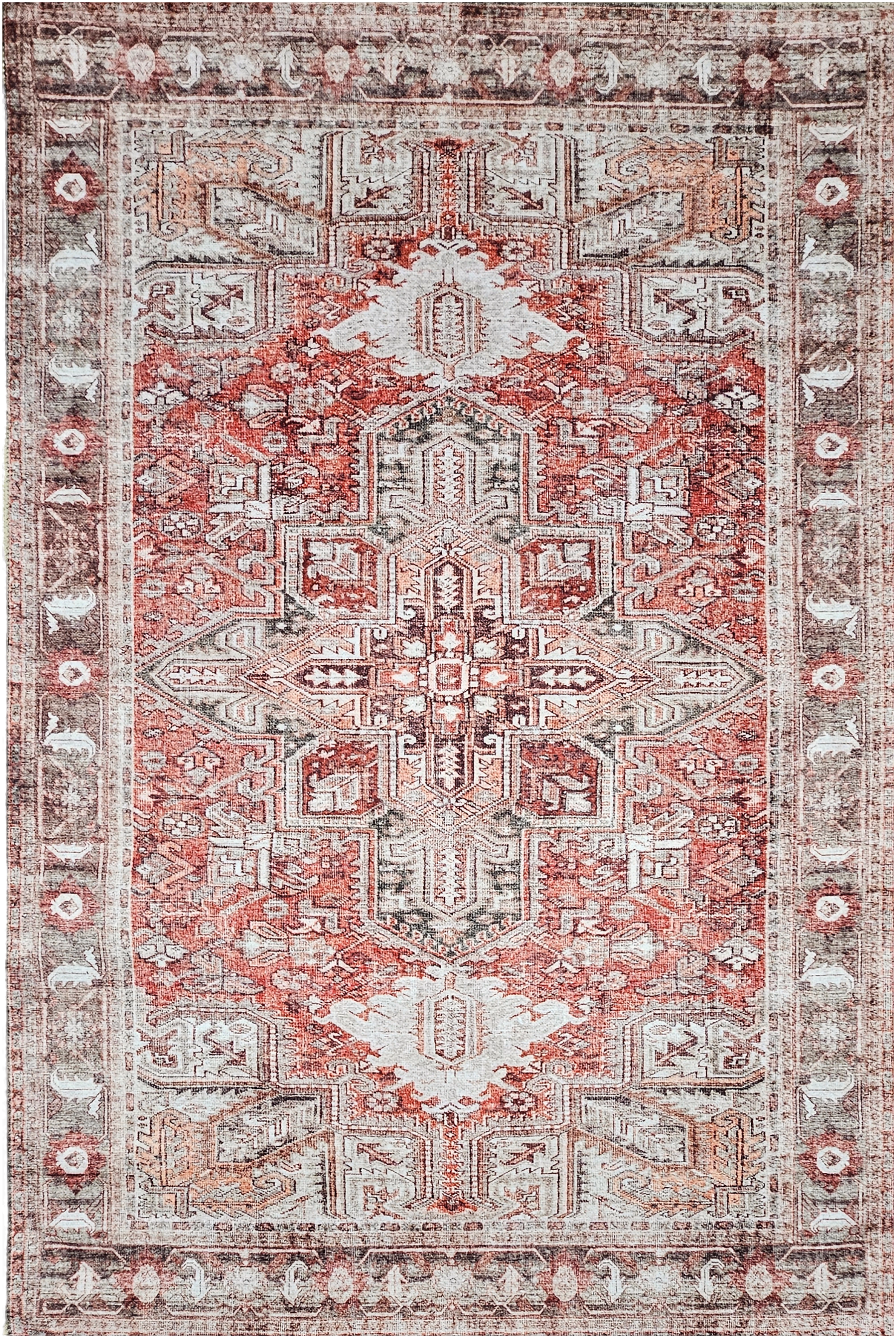
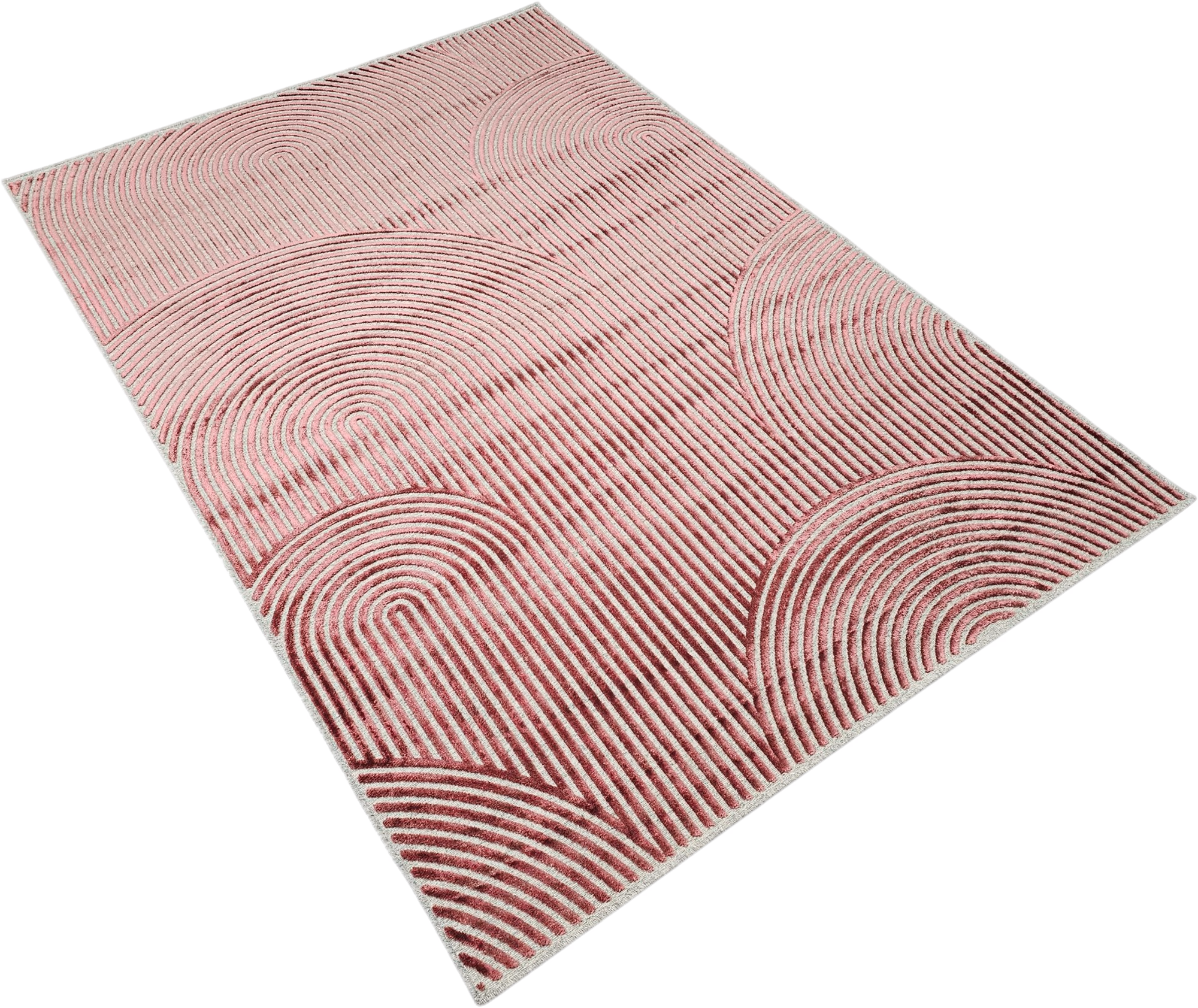
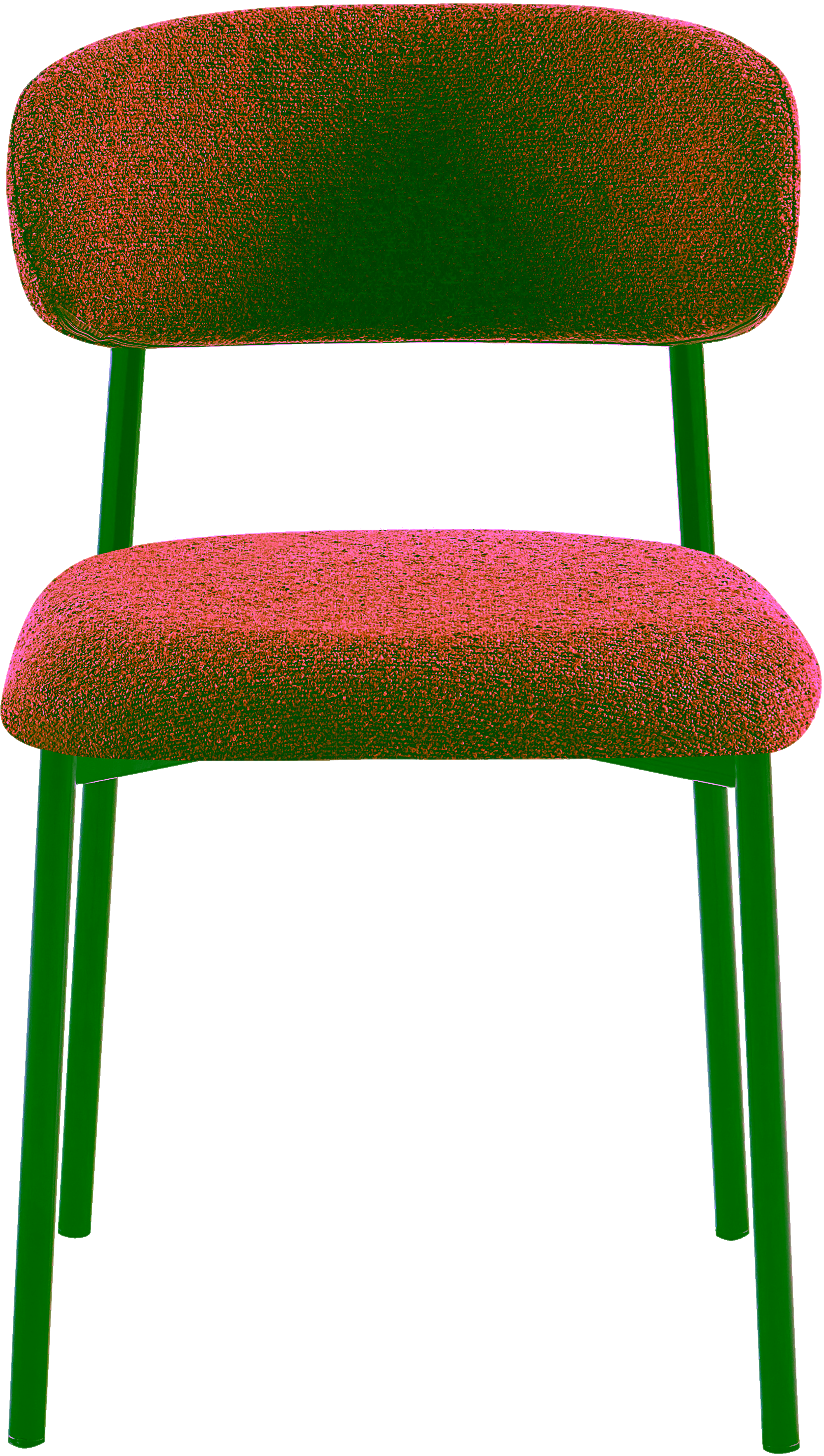
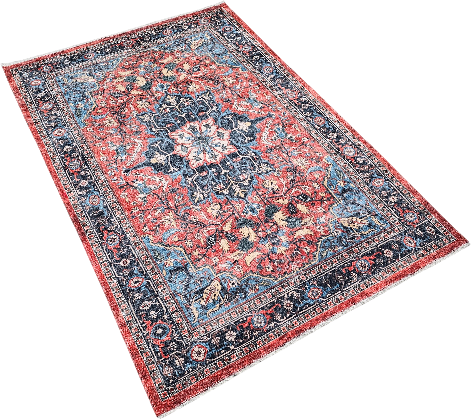
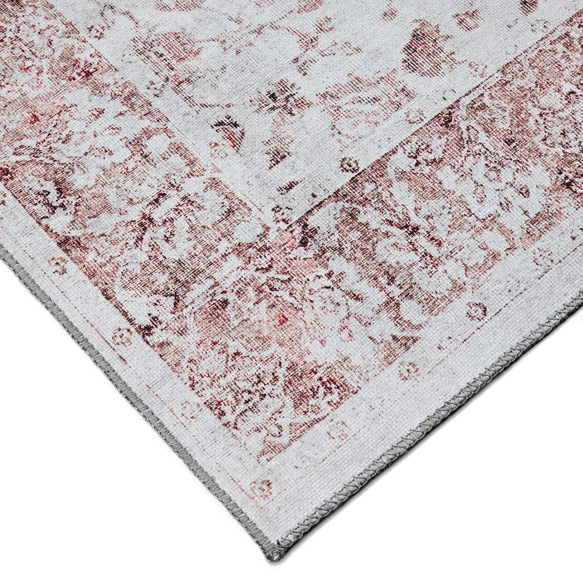
Red appears across 5 product families and 12 options, especially on Dining Chairs and Rugs.
Visual meaning
Red has the strongest emotional charge of the standard furniture palette. Even dark or muted reds carry more urgency than comparable browns or oranges.
That is why red benefits from context. In small doses it adds confidence and warmth; in large uninterrupted fields it can dominate the room's rhythm.
How to pair it
Use red with grounding neutrals and deep anchors. Beige, walnut, charcoal and off-white let red feel intentional instead of aggressive.
If you want a richer designer palette, pair muted red with dark green or deep blue in unequal amounts. One should lead and the other should stay secondary.
Palette planning cues
Works well with
- beige
- brown
- black
- ink blue
- forest green
Use in the room
Start from undertone before hue intensity. If the colour reads warm, pair it with warm neutrals or a controlled cool counterpoint instead of unrelated cool greys.
Build one dominant field, one bridge neutral and one accent. That is the simplest way to keep a furniture package coherent instead of scattered.
Browse related products