Colour guide
Orange
Orange in interiors: Brings warmth, movement and sociability, so it reads more active than beige, grey or blue.
2 product families
5 options
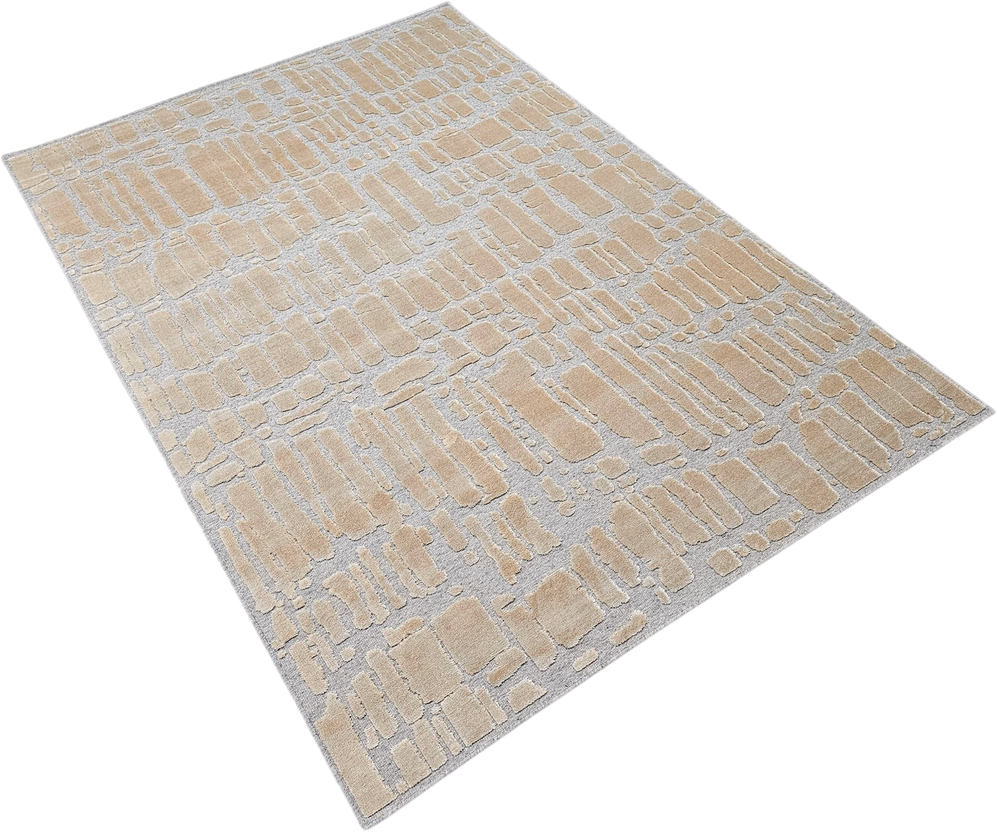
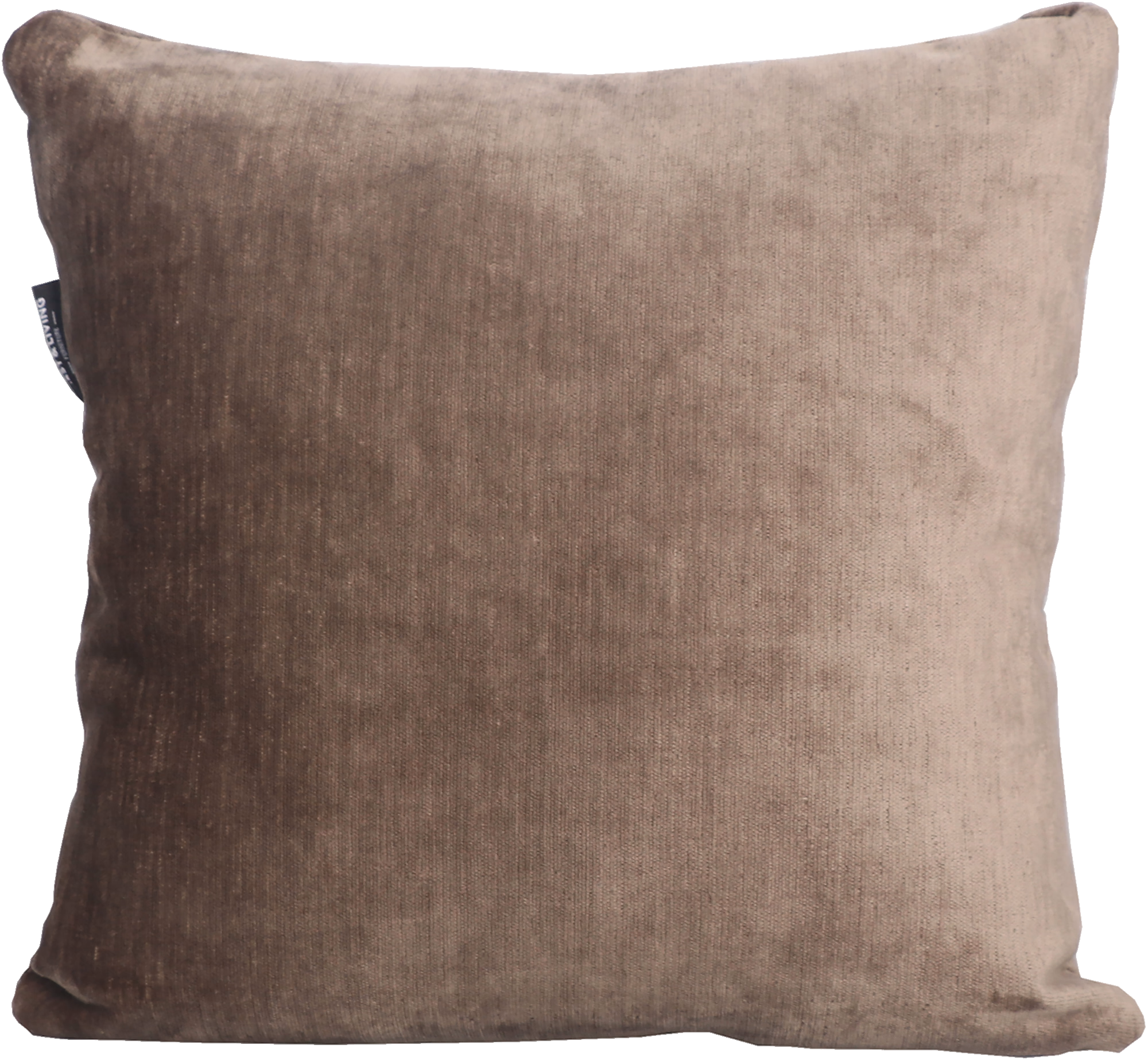
Orange appears across 2 product families and 5 options, especially on Decorative Cushions and Rugs.
Visual meaning
Orange sits opposite blue in classic colour theory, so even a small amount can wake up a cool interior. In furniture, however, fully saturated orange is rarely the safest route; muted rust and clay versions are easier to live with.
Because orange advances visually, it makes objects feel closer and more present. That is useful for focal chairs, cushions and rugs but can overwhelm large rooms if repeated without restraint.
How to pair it
Balance orange with cool or neutral structure: blue-grey textiles, black framing, beige walls or natural wood. That turns energy into warmth instead of chaos.
A practical rule is one orange focal element supported by quieter warm neighbours such as tan, walnut or sand. Let the accent work, then stop.
Palette planning cues
Works well with
- blue
- brown
- beige
- olive
- walnut
Use in the room
Start from undertone before hue intensity. If the colour reads warm, pair it with warm neutrals or a controlled cool counterpoint instead of unrelated cool greys.
Build one dominant field, one bridge neutral and one accent. That is the simplest way to keep a furniture package coherent instead of scattered.
Browse related products