Colour guide
Multicolour
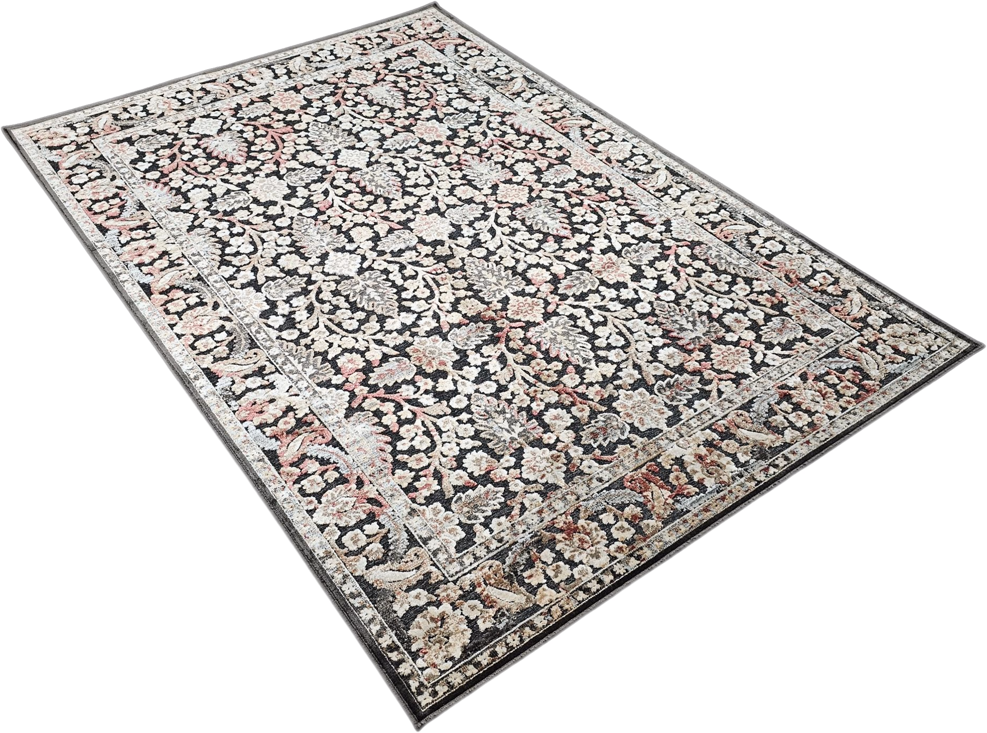
Multicolour in interiors: Adds movement, layering and narrative, but needs hierarchy to avoid visual noise.
1 product family
2 options
Multicolour appears across 1 product family and 2 options, especially on Rugs.
Visual meaning
Multicolour pieces work through hierarchy, not through using every colour equally around the room. The eye needs to recognise one dominant tone, one supporting neutral and only a small number of repeated accents.
Pattern, texture and colour interact here. A multicolour rug or upholstery can solve the whole room palette if you sample from it carefully instead of competing against it.
How to pair it
Pick the calmest neutral visible inside the item and repeat it on the largest surrounding surfaces. Then echo one stronger colour once or twice in cushions, art or lighting.
Avoid introducing new unrelated accent colours nearby. With multicolour furniture, editing is the design skill that keeps the room coherent.
Palette planning cues
Works well with
- one repeated dominant colour
- one bridge neutral
- one accent lifted from the pattern
Use in the room
Start from undertone before hue intensity. If the colour reads warm, pair it with warm neutrals or a controlled cool counterpoint instead of unrelated cool greys.
Build one dominant field, one bridge neutral and one accent. That is the simplest way to keep a furniture package coherent instead of scattered.
Browse related products