Colour guide
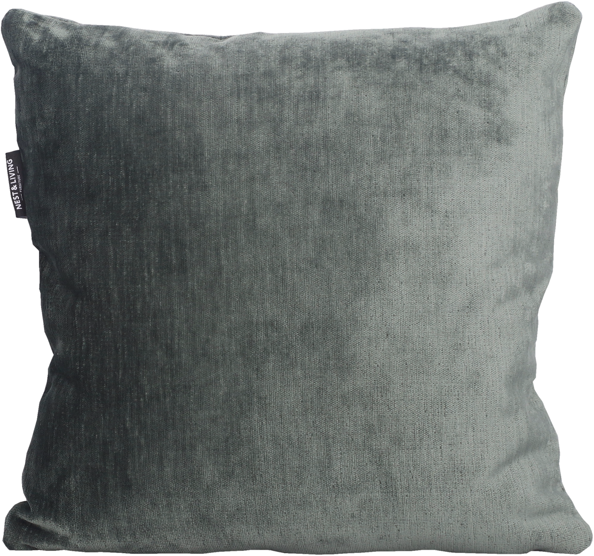
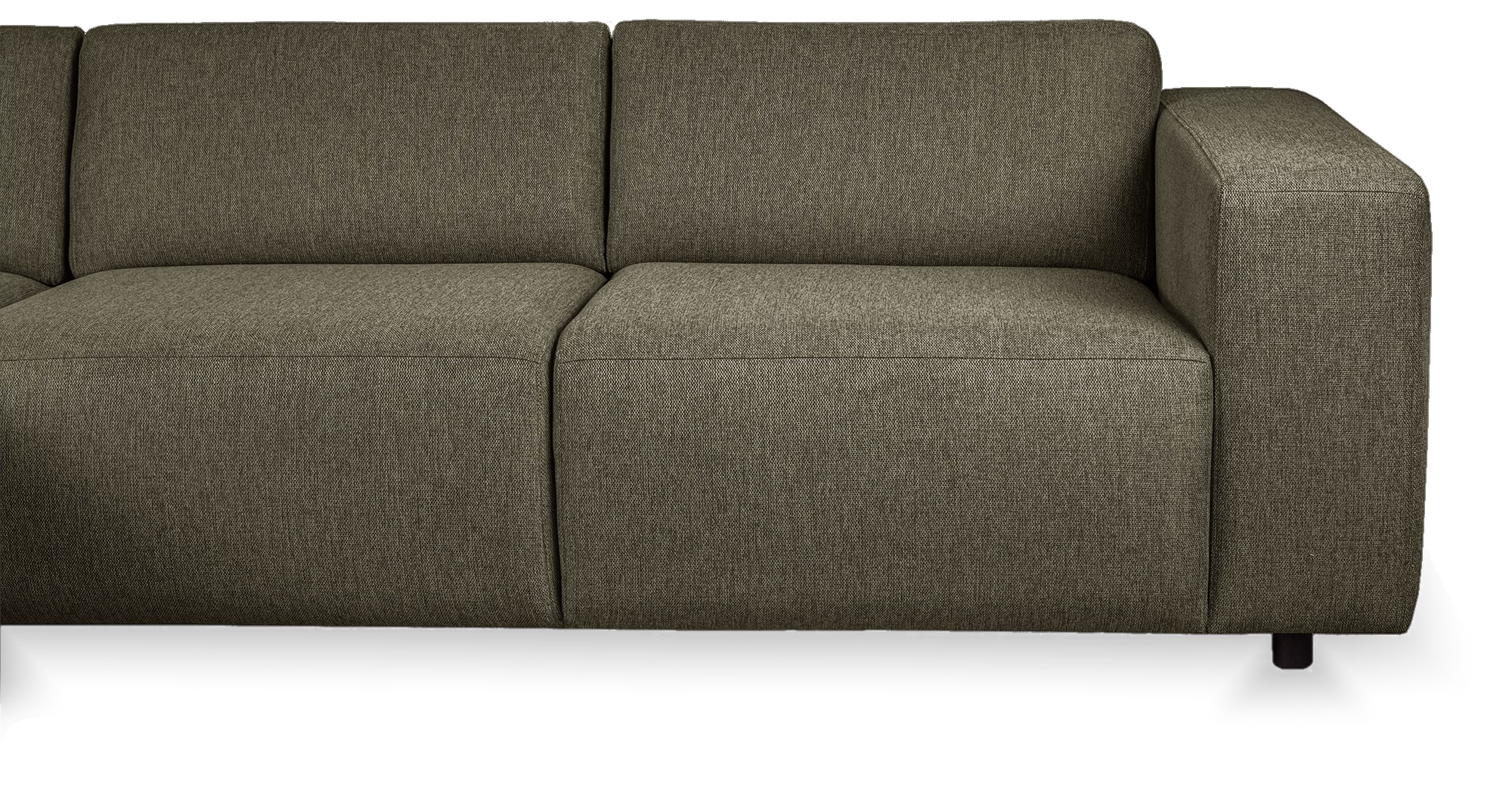
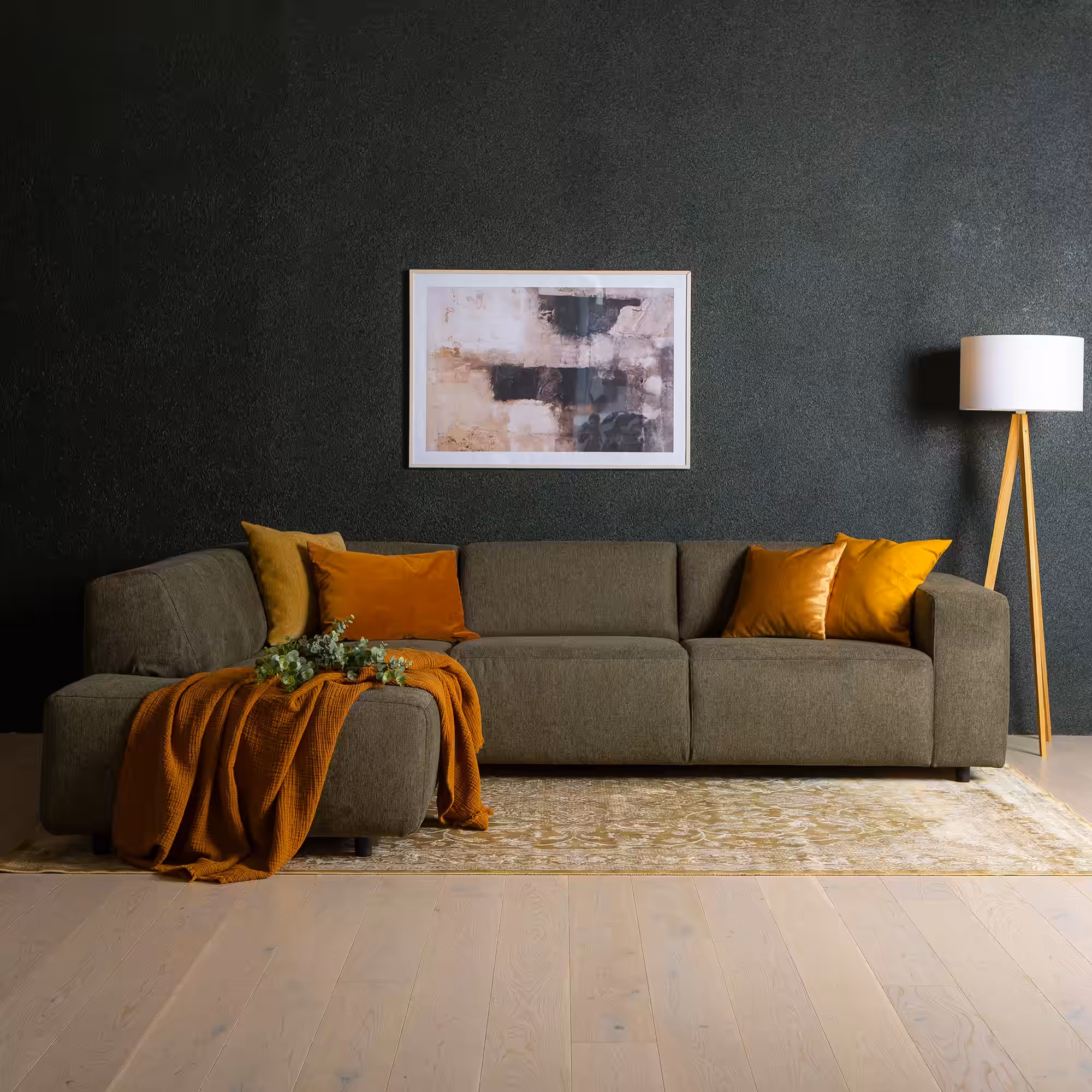
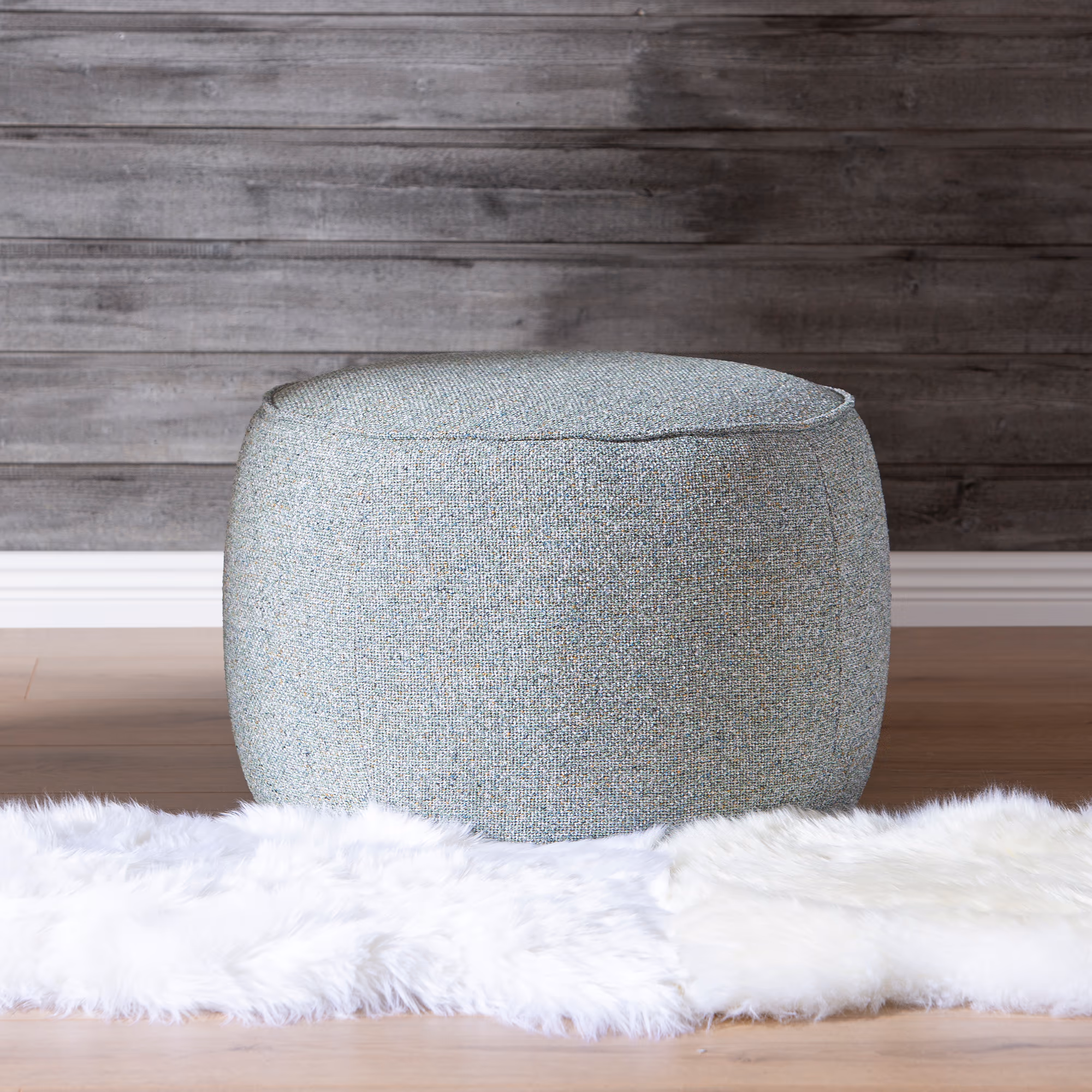
Green
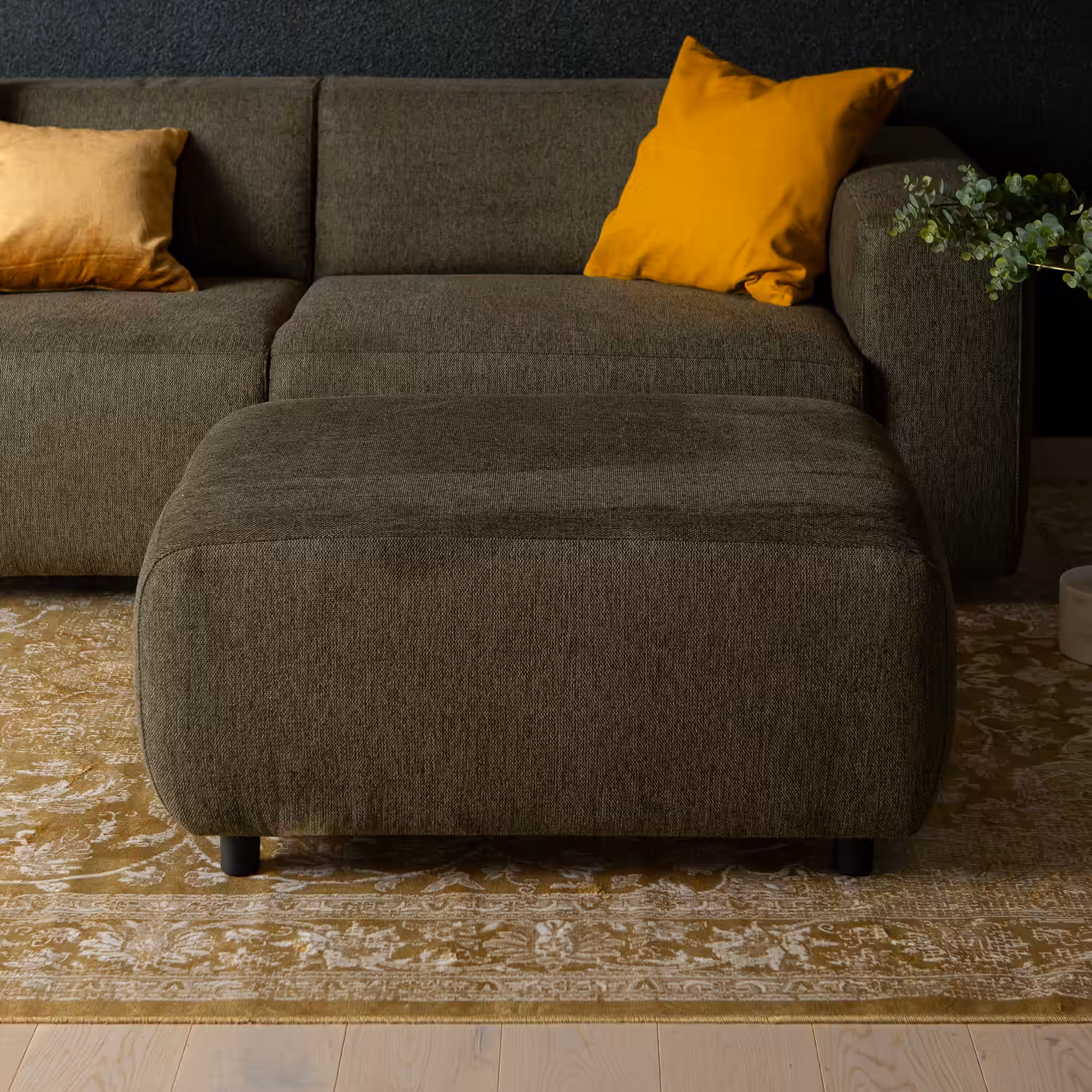
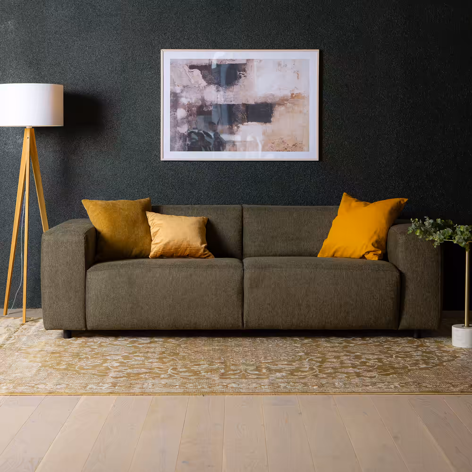
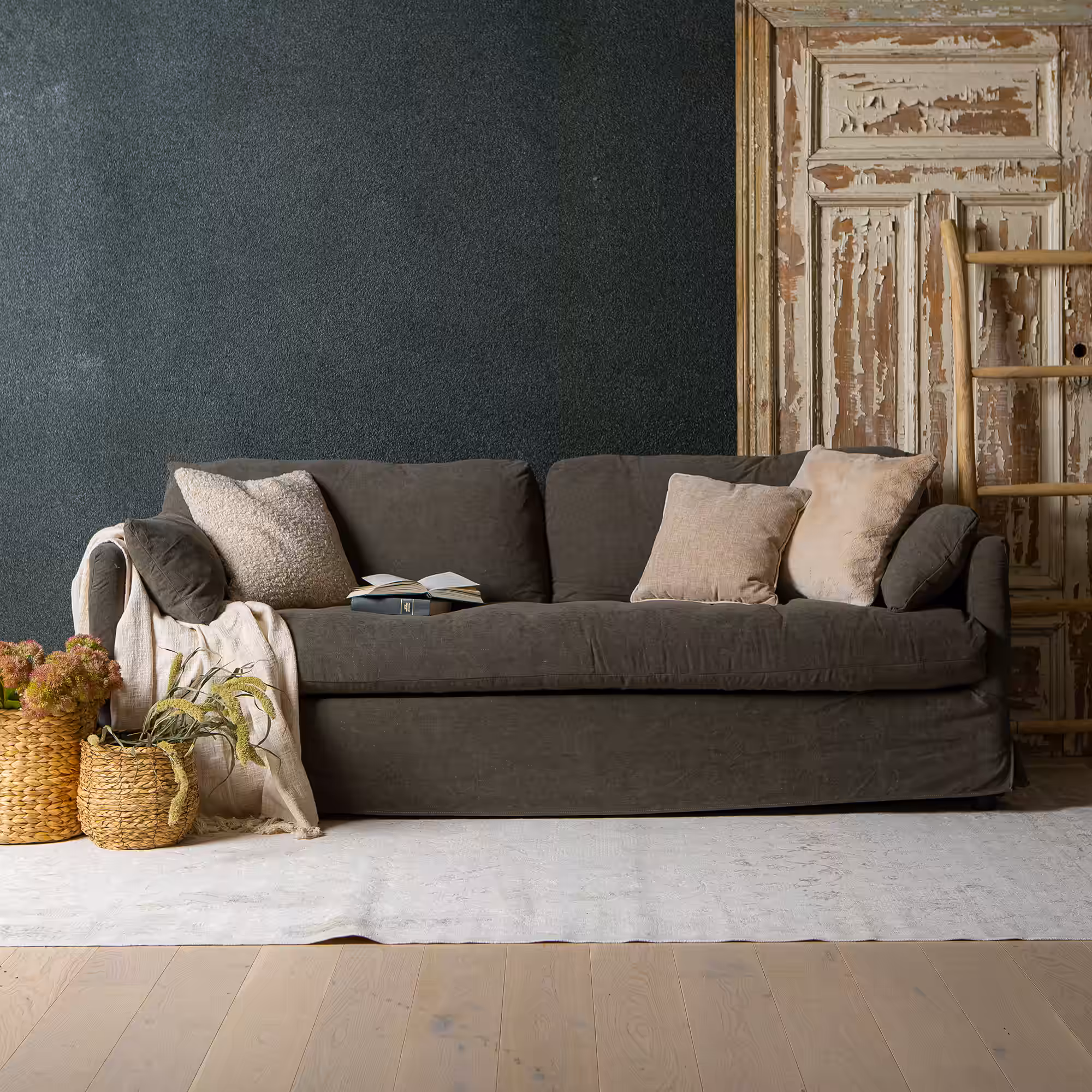
Green in interiors: Feels organic and restorative, especially when paired with wood and stone-like neutrals.
10 product families
14 options
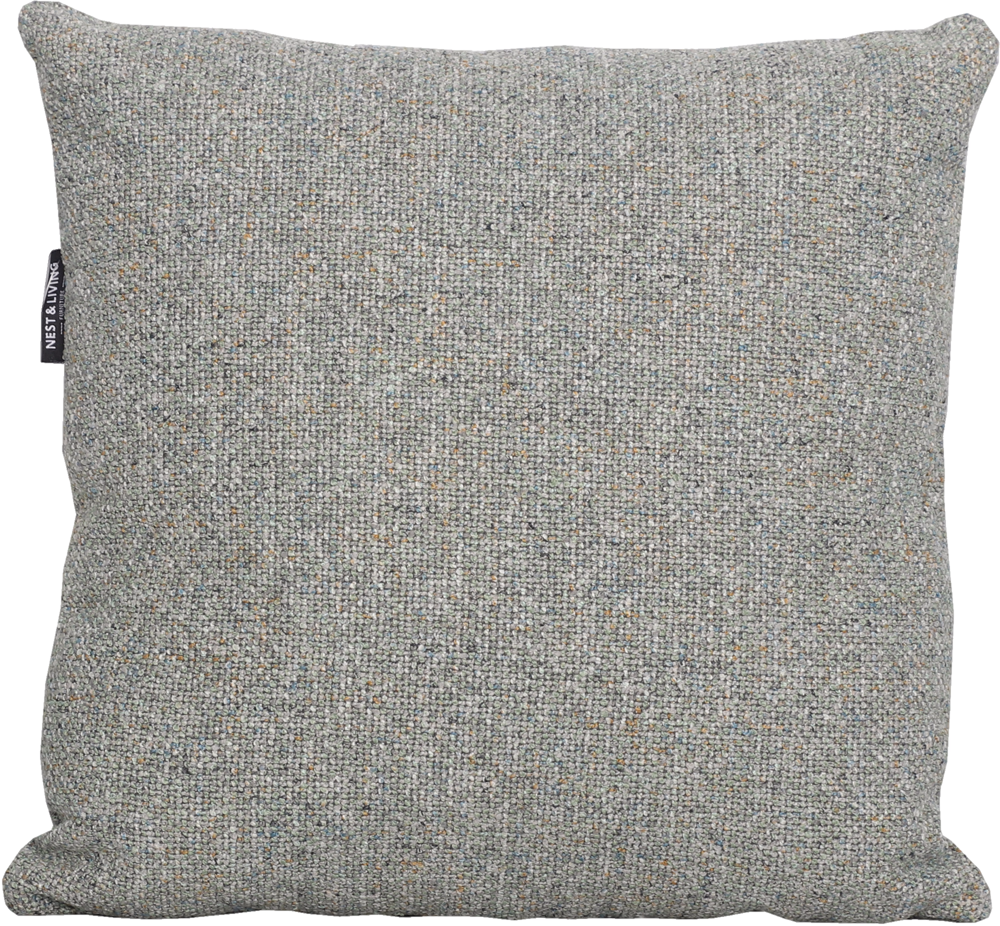
Green appears across 10 product families and 14 options, especially on 3-Seater Sofas, Armchairs, Chaise Sofas, Corner Sofas, Decorative Cushions and Footstools and 1 more.
Visual meaning
Green sits between warm and cool depending on undertone, which makes it one of the most flexible accent families in interiors. Olive and moss tones feel grounded, while blue-greens feel fresher and calmer.
Because green is common in nature, it often reads as restful even at moderate saturation. The risk is not excess intensity alone but undertone clash with nearby woods or wall colours.
How to pair it
A dependable scheme is green plus beige plus wood. That gives a layered natural palette without needing many additional colours.
For a more designed effect, pair green with a deep anchor such as black or espresso and let one lighter neutral carry the larger surfaces. That keeps the green intentional rather than scattered.
Palette planning cues
Works well with
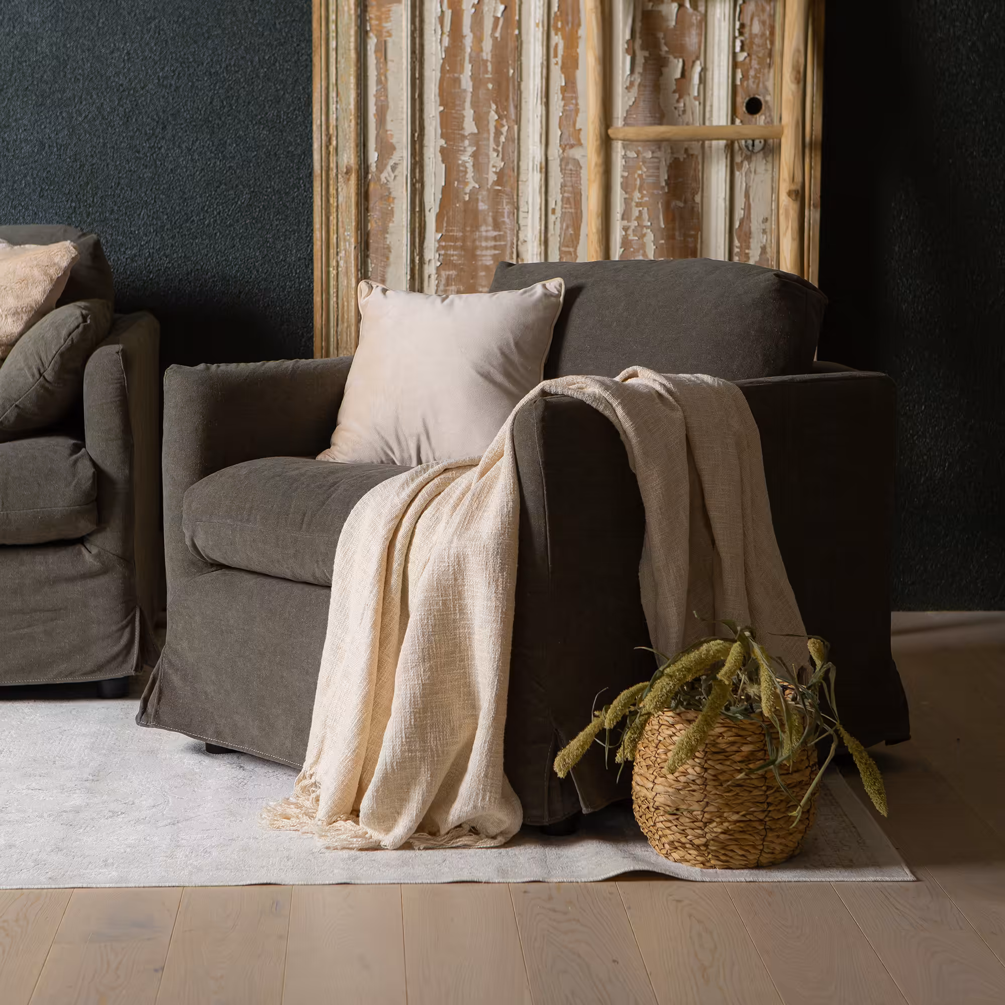
- beige
- brown
- oak
- black
- soft pink accents
Use in the room
Start from undertone before hue intensity. If the colour reads warm, pair it with warm neutrals or a controlled cool counterpoint instead of unrelated cool greys.
Build one dominant field, one bridge neutral and one accent. That is the simplest way to keep a furniture package coherent instead of scattered.
Browse related products