Colour guide
Blue
Blue in interiors: Feels calm, slightly distant and airier than warm colours of equal depth.
1 product family
2 options
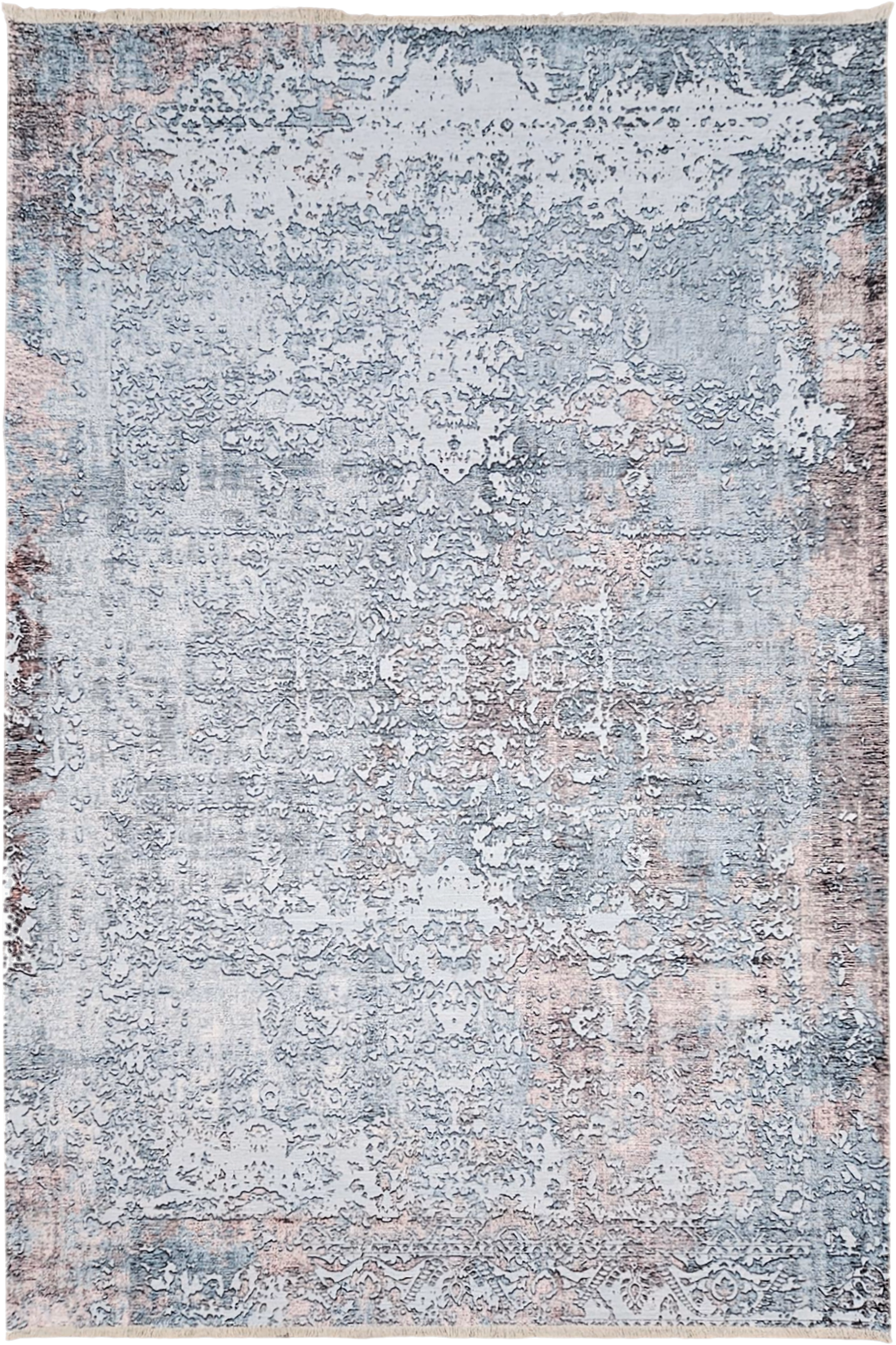
Blue appears across 1 product family and 2 options, especially on Rugs.
Visual meaning
Blue is a receding colour in most interiors, which is why it calms large forms and can make a piece feel visually lighter than the same object in orange or red.
Its biggest variable is saturation. Dusty blue reads almost neutral, while clean bright blue behaves like an accent and needs tighter editing around it.
How to pair it
For a quiet scheme, pair blue with beige, soft white and warm timber. That creates warm-cool balance without dramatic contrast.
For more energy, use the classic complementary idea: controlled blue with touches of rust, cognac or muted orange. Keep the warm note as an accent, not a second dominant field.
Palette planning cues
Works well with
- beige
- white
- warm oak
- rust
- camel
Use in the room
Start from undertone before hue intensity. If the colour reads warm, pair it with warm neutrals or a controlled cool counterpoint instead of unrelated cool greys.
Build one dominant field, one bridge neutral and one accent. That is the simplest way to keep a furniture package coherent instead of scattered.
Browse related products