Colour guide
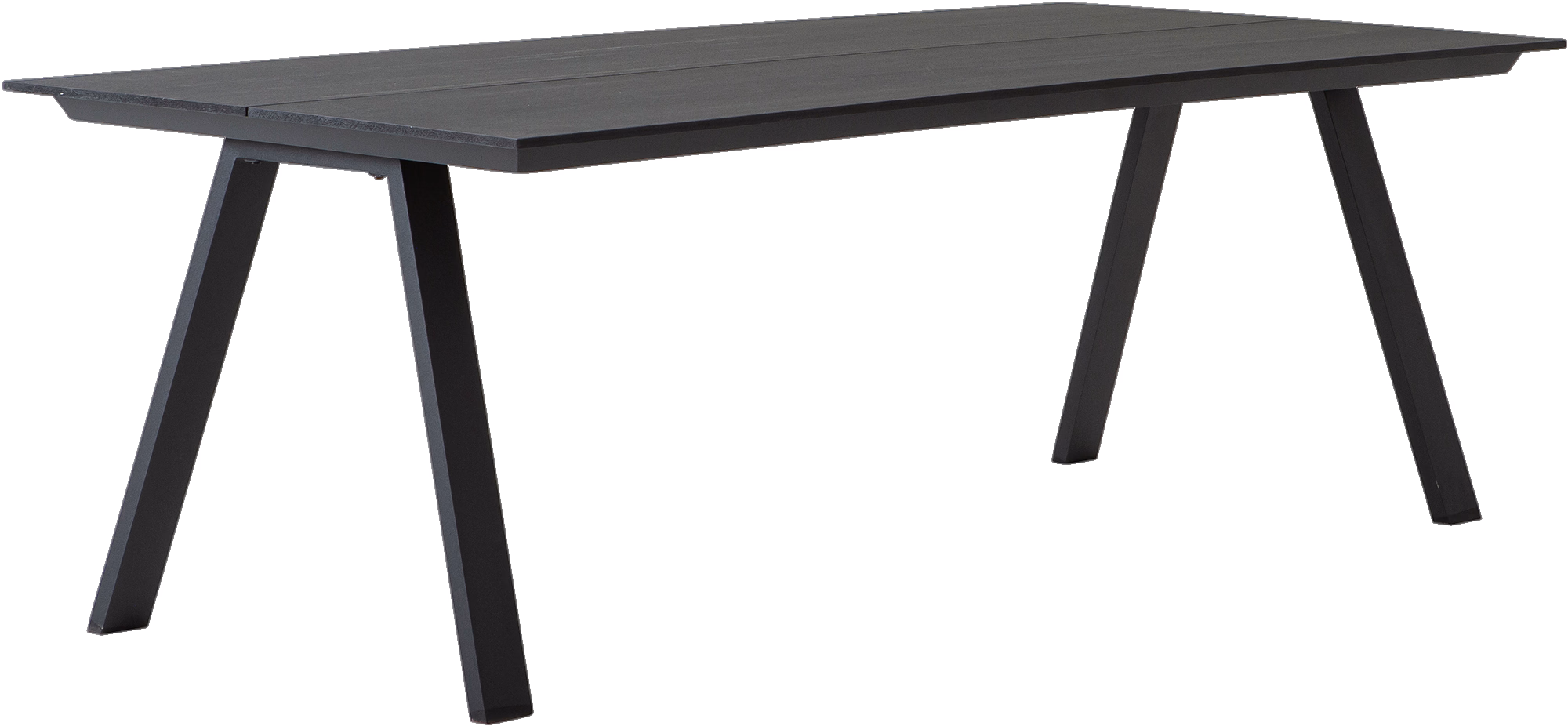
Black
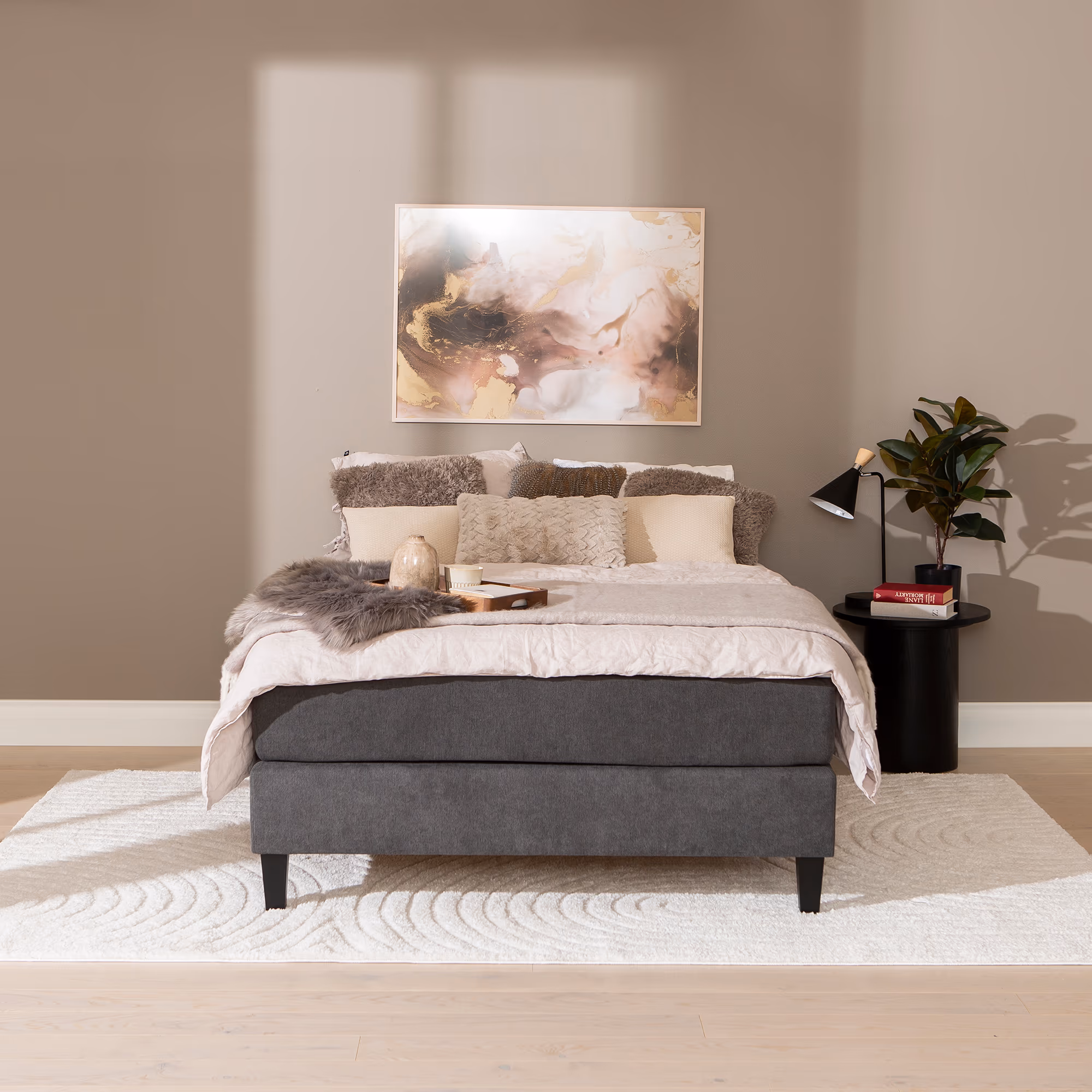
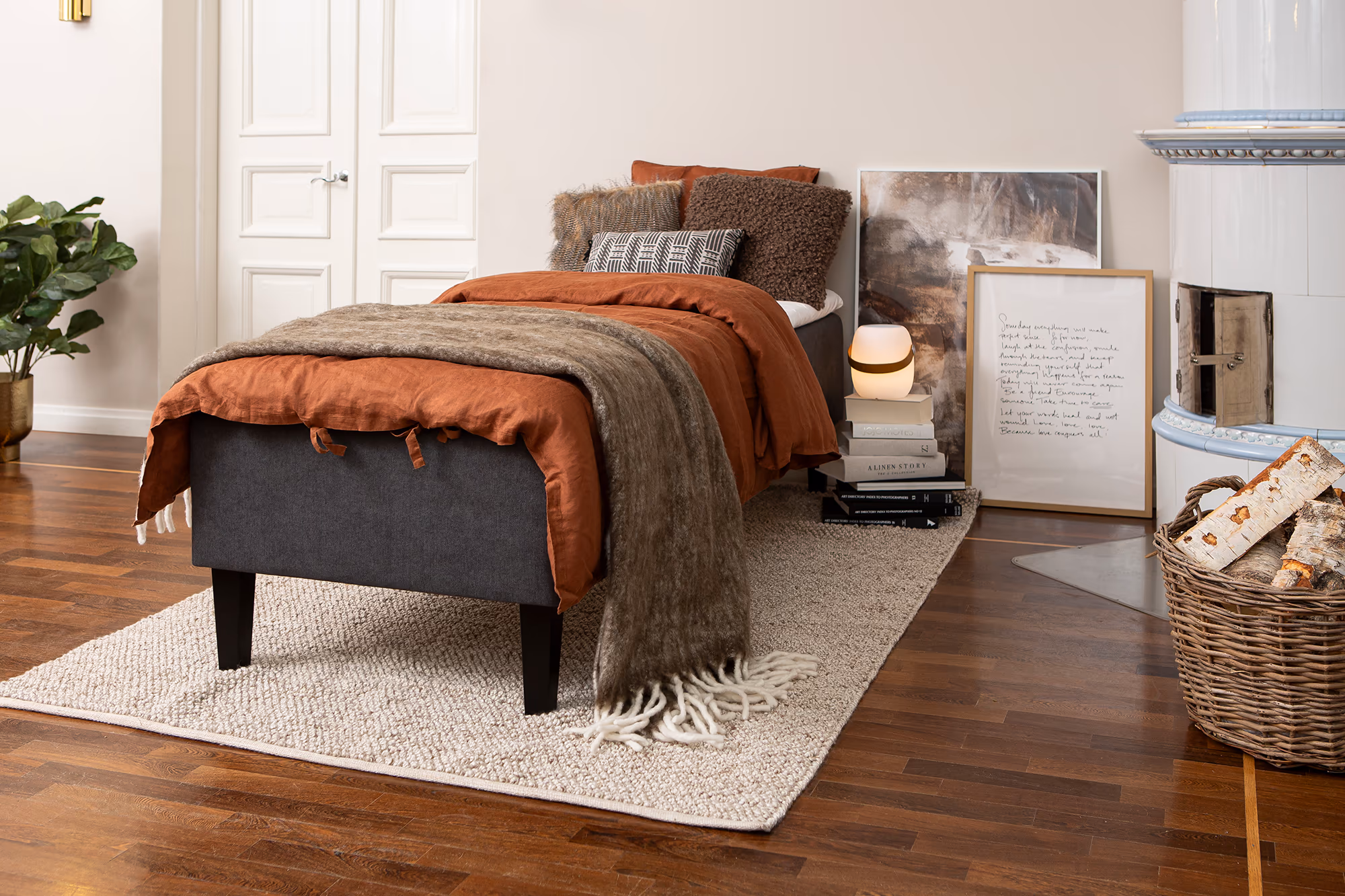
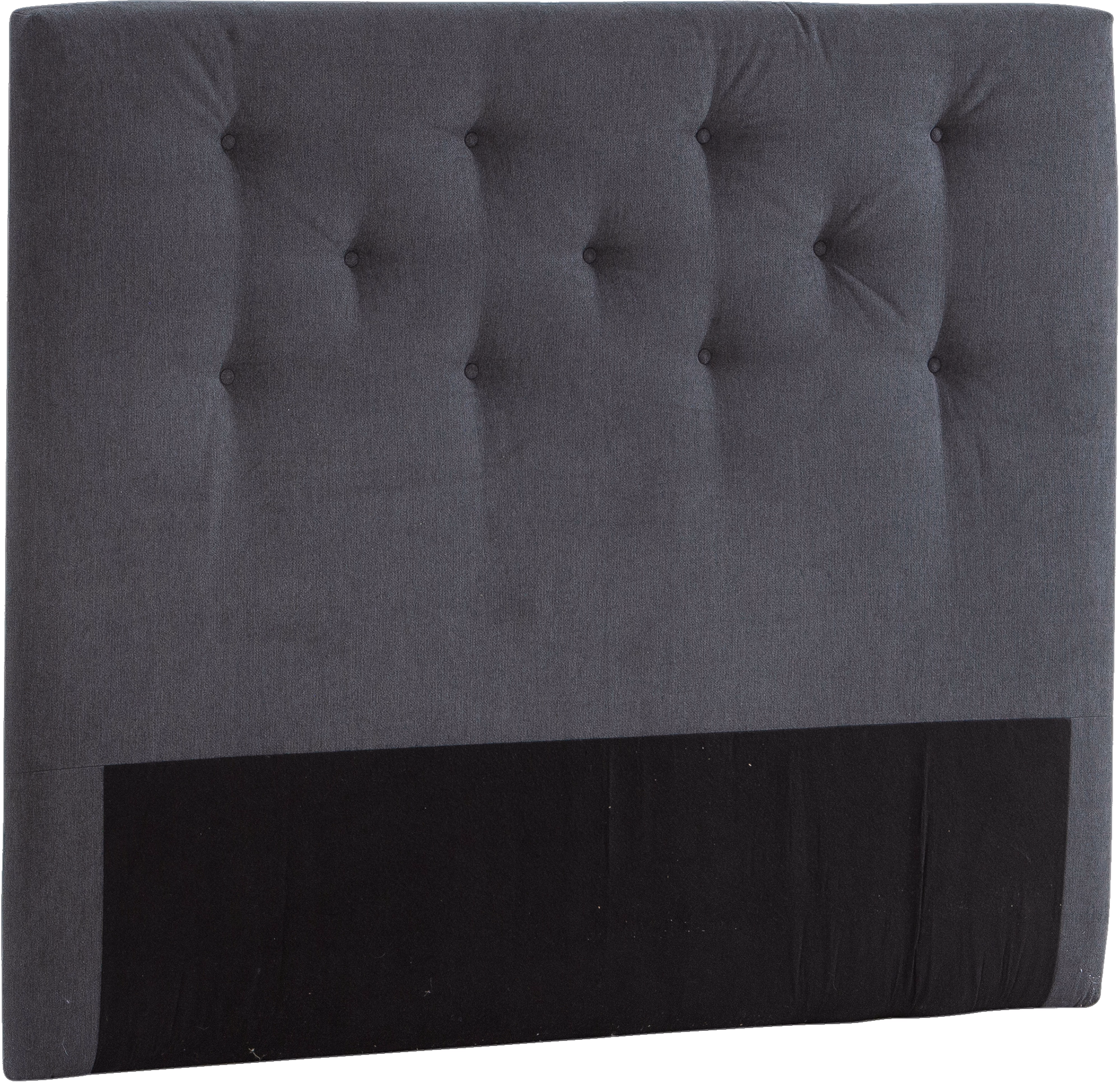
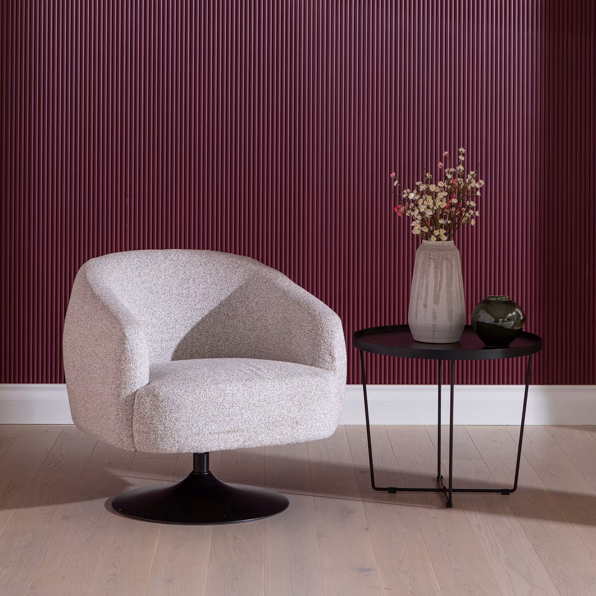
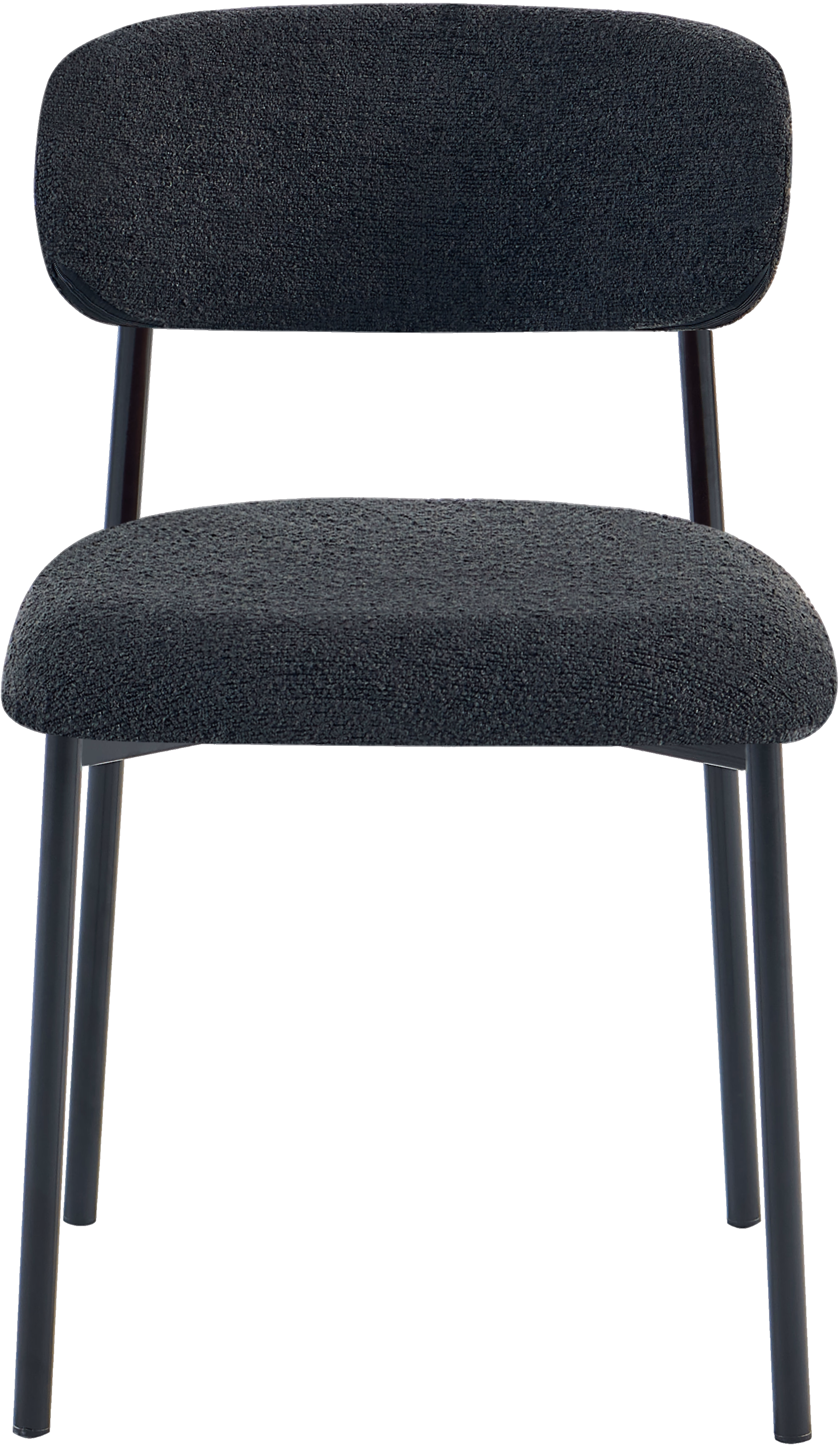
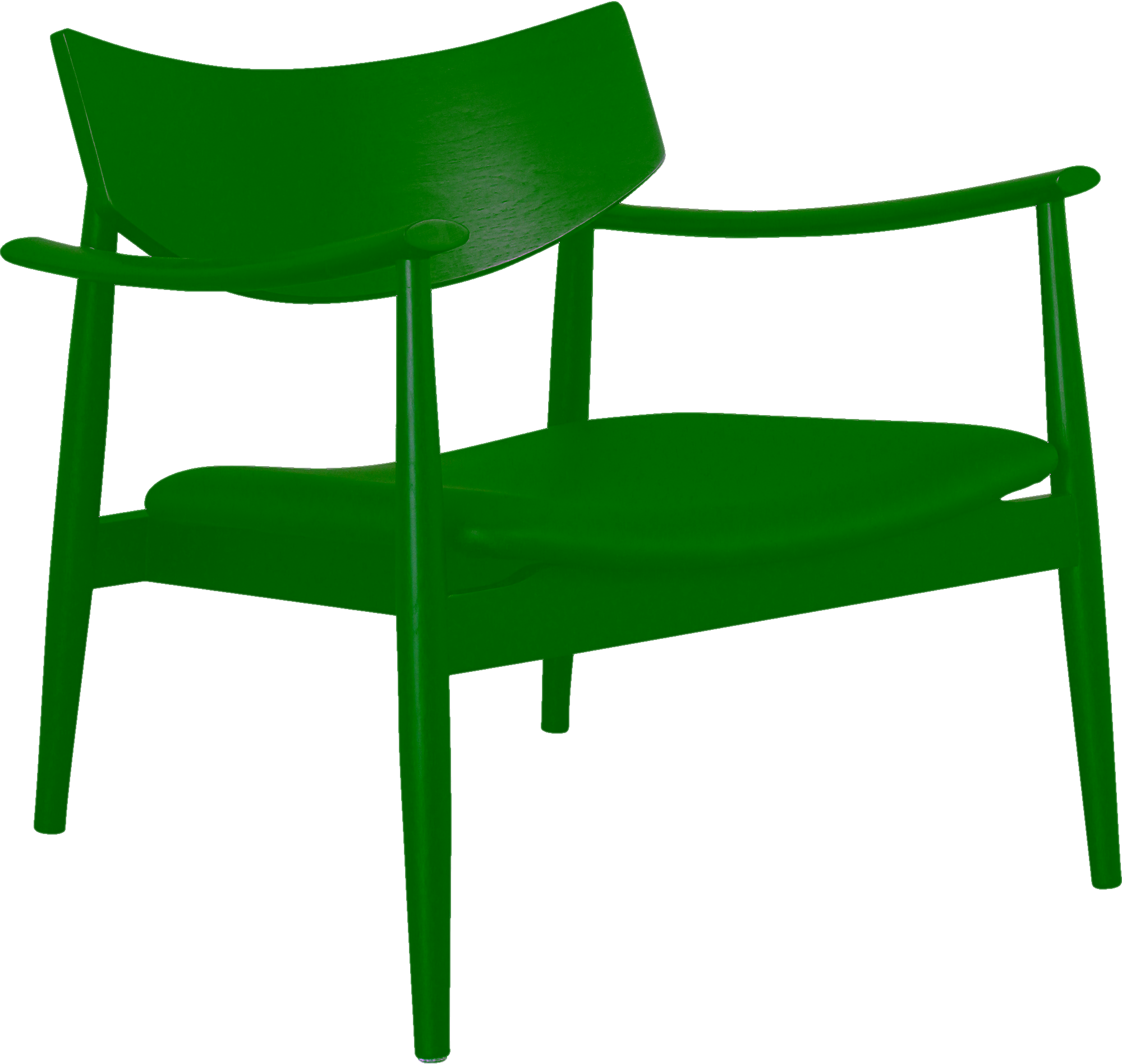
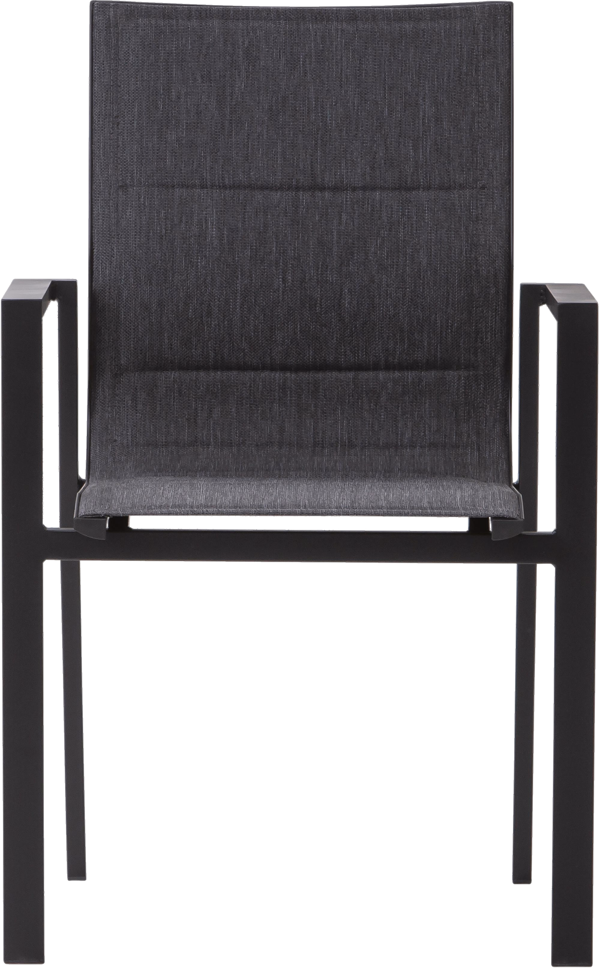
Black in interiors: Frames space, sharpens silhouettes and creates the strongest value contrast available in an interior palette.
17 product families
63 options
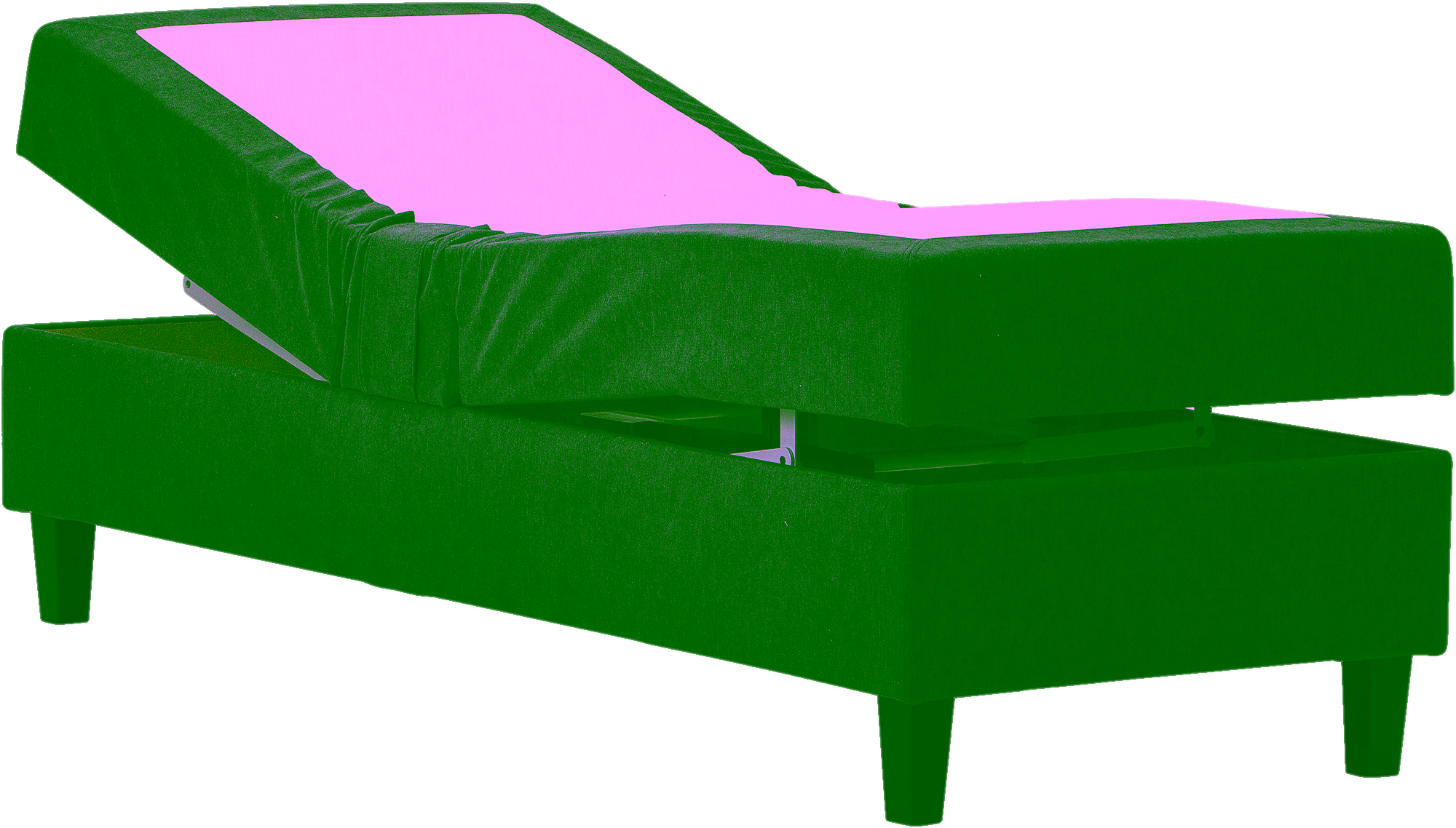
Black appears across 17 product families and 63 options, especially on Adjustable Beds, Cabinets Display, Continental Beds, Dining Chairs, Divan Beds and Fixed Armchairs and 9 more.
Visual meaning
Black is less a background colour than a visual anchor. It pulls edges into focus, increases contrast around neighbouring surfaces and can make surrounding colours appear cleaner and more saturated.
Because it absorbs light, black furniture visually recedes in bright rooms yet can feel heavy in low light. Finish matters: matte black feels softer, while glossy black behaves almost like a mirror.
How to pair it
Use black as the linework of the room: legs, frames, lamps, handles or one dominant statement piece rather than repeating full black masses everywhere.
The most reliable balance is black plus a light neutral plus one natural material. Wood, boucle, linen-like fabric and warm stone stop the palette becoming flat or severe.
Palette planning cues
Works well with
- white
- beige
- oak
- walnut
- brass
Use in the room
Start from undertone before hue intensity. If the colour reads warm, pair it with warm neutrals or a controlled cool counterpoint instead of unrelated cool greys.
Build one dominant field, one bridge neutral and one accent. That is the simplest way to keep a furniture package coherent instead of scattered.
Browse related products